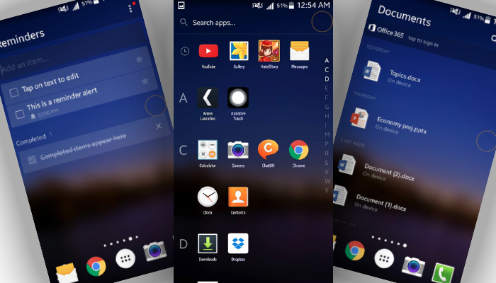
Launchers are made in order to get out of the norm of utilizing the default Android OS by replacing its interface and customization options but not how the normal apps work like messaging, calling, etc. One launcher that has been very big and influential this year is Microsoft’s Arrow Launcher. It gives you the opportunity to experience Microsoft as an appetizer. In this article, we will go over its interface and customization options to give you a glimpse of what you can expect when you install the free launcher in your Android smartphones.
Interface
The interface can directly be compared to how Microsoft’s OS works. It is simple, neat, elegant, and sophisticated all at once. It contains left and right swiping through the screen as it takes a cleverer and smarter approach to display your frequently used apps in hand. When you set the launcher up, it lets you choose eight (8) of your frequently used and opened apps so that it can be prioritized; Arrow puts those 8 in the main page when you open your phone.

As mentioned above, you can swipe to take you to different pages with different uses. Swiping to the right takes you to the recent activity you have done; this includes photos taken, documents edited, etc., the next swipe leads you to the widgets. Give it another swipe and it’ll take you to your documents page (if you have any), another swipe takes you to the notes and reminders page; giving it another swipe will open up the page of your most contacted people.
Read: Revamp your Android’s home screen fro better experience
Opening the main menu is where it all changes. The main menu provides you with the alphabetical list of your applications. Yes from A-Z, you will be able to see your applications profoundly neat and easily accessible.
Customization
Arrow Launcher offers you a number of customizations from wallpapers, settings, update-checking, hiding and unhiding of applications, and the easy edit of notes and reminders. It is not just about the design, the color, and the capacity to bring color to your screen. Arrow’s ability to let you create your own pages in terms of utility is simply astounding.
You can also penetrate the Settings of the launcher itself by clicking the three-dotted menu button at the top right corner of every page. This leads you to the Arrow Settings where you can change options depending on how you want to experience the launcher.
Overall
If I were to summarize my Arrow Launcher experience in one word, it would be “easy.” Arrow wants its users to utilize smartphones in the easiest and cleanest way possible. Right now, I can say that Windows 10 mobile smartphones are one of the easiest and neatest operating systems I have ever seen and this is because of Arrow. Arrow showers Android users of its simplicity and class by maintaining the Windows feel while being in the realms of Android.
Read: Tips and Tricks for your Android device
Arrow has over a million users now and it is simply dumbfounding. It is the clear but incomplete replica of how Windows phones work. Nevertheless, the sensation and experience it provides to its users is simply breathtaking. If you are after a launcher that is smooth, clean, easy-to-use, and it offers prioritization, then Microsoft’s Arrow Launcher is perfectly built for you.